With 85% of visitors accessing the 2-1-1 sites on their mobile devices, Mobile Ready simply isn’t good enough.
Mobile Friendly is the goal.

The 2-1-1 Childcare Search feature is part of the State of Connecticut’s 2-1-1 network of online support sites. These sites have an abnormally high percentage of mobile users. With this in mind, several of their features needed to be retooled to be more mobile friendly than they currently were. For this project, the site, the branding, the colors, and even the features we were working on already existed. The goal was to clean up and improve, especially where mobile was concerned.
UX Challenges
One of the features that needed work was a mobile-friendly comparison table. Since tables tend to cause problems for smaller screens, the standard solution is to dump the table on mobile and find a different way to display the data. However, this does not work for comparison tables. Removing the table pattern breaks the main intent, which is to compare items side by side.

A second feature that needed simplification was the ability to drill down into results of state inspections on any given childcare provider. While straight forward, it took three taps to navigate into inspection details, and three to get back out. If you wanted to look at details for multiple locations, that was a minimum of 6 for every childcare center. If you wanted to look at multiple inspections for each location, it took even more. The excessive taps/clicks were also present in the desktop view.
There was also an issue where visitors could feel lost. Technically there were ‘sign-posts’ to show you where you were and where you came from. However, the implementation of these was unwieldy enough to cause a loss of context. A visitor might exit the inspection details and not know which item had just been reviewed.

Additionally, there was also a public “watchdog” site available. The information on it was sparse and targeted solely at identifying problems with childcare providers. The 2-1-1 site needed to make sure it covered all of the important details already in the watchdog site, while also providing information critical to helping parents make informed choices based on a variety of attributes.
UX Solutions
External Research:
A full comparison between the 2-1-1 site and the watchdog site was conducted. All features of both sites were identified and compared.

Also, all of the provider information currently available on both site was mapped, highlighting information gaps on each. The stakeholders were able to use this information to decide whether anything needed to be added to the 2-1-1 site and adjust accordingly.

Internal Research:
An inspection was performed of the search application’s current state and the information architecture for childcare providers was mapped. It was discovered that there was no single place where all of the information for a provider could be found. All of the information was on the site, but it was spread amongst different locations. Adjustments to the information architecture to enable visitors to more easily find what they needed were proposed to the stakeholders.

Mobile Comparison Chart:
To tackle the issue of a mobile comparison chart, I started by researching solutions online. Most of what was found were simply scrolling tables. There was very little in the way of a modern, slick pattern already out there. So to the drawing board we went. A number of solutions were considered initially.

After further consideration, only a few options were prototyped for testing. Of those prototypes, all of them had several traits in common.
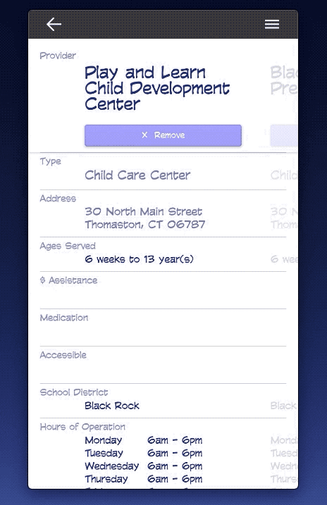
- Only one provider is fully on screen at a time, though other providers are indicated.
- The traits are all aligned between screens allowing for easy side by side comparison by swiping left and right.
- The header, containing the provider name and a ‘remove’ button, is pinned to the top of the screen so that you never lose sight of know which provider you are looking at.
Additionally, a filter was added allowing the visitor to show/hide the various attributes so that they can focus on comparing only those items they care about.

The other goals we needed to achieve with the comparison tables were to:
- Keep the attribute labels on screen for each provider.
- Make it obvious that there are other options to view.
- Make it easy to use on a mobile touch screen.

Inspections data:
When it came to finding a solution to streamline the inspections data, a number of promising approaches were initially drawn up, including sliding panels and accordions.

This was one of those times where the stakeholders had their own ideas on how things might work and a strong desire to see them at least mocked up. Several of these concepts were designed, and a couple of them were ultimately prototyped and tested.

Medium fidelity prototypes were created for a number of these designs, but after some internal testing, the one solution that worked best for both mobile and desktop alike was a simple popup window. This window listed all inspections with details hidden behind disclosure panels.

The number of taps between providers was reduced from six to five. A small improvement, tap-wise, but the number of taps within a single provider’s history was cut in half, from two to one, which adds up quickly when researching multiple providers.
The new design also greatly increased the user’s sense of location and improved the overall readability of the information.
This project is still under development.
Tasks
Heuristic Site Review
Research
Wireframes
Prototypes
Full-color Mockups
Design Specs
Tools
Sketch
InVision App
InVision Studio
Principle App
Origami
Team
Client – State of Connecticut, 2-1-1 services
Development Team – United Way of Connecticut
Executive Team Lead – Leo Pellerin, CIO
Project Lead – Scott Robidoux
Research – Christopher Wilson
UX Designer – Christopher Wilson
Visual Designer – Christopher Wilson
Lead Developer – Chris Davidson
